
Mobile-first design has evolved from a nice-to-have feature to an absolute necessity in 2025. With mobile devices generating over 68% of global web traffic, designing primarily for mobile users and then scaling up to desktop creates more intuitive, performant, and successful digital experiences.
1. Core Mobile-First Design Principles
Mobile-first design fundamentally changes how we approach user interface and user experience design. Instead of starting with a desktop layout and shrinking it down, we begin with the most constrained environment—mobile—and progressively enhance for larger screens.
This approach forces designers to prioritize essential content and functionality, eliminate unnecessary elements, and create streamlined user flows that work efficiently in limited screen real estate. The result is cleaner, more focused designs that benefit users across all devices.
Essential Mobile-First Principles
Content Priority: Start with the most critical content and features. Use the 80/20 rule—80% of users need only 20% of features. Design for the primary user journey first, then add secondary features for larger screens.
Progressive Enhancement: Build a solid foundation for mobile, then layer on enhancements for tablets and desktops. This ensures your core experience works everywhere while providing richer experiences where screen real estate allows.
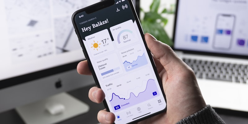
Touch-First Interactions: Design for fingers, not cursors. All interactive elements should be easily tappable with minimum 44px touch targets. Consider thumb zones and one-handed usage patterns for optimal ergonomics.
Performance Constraints: Mobile users often have slower connections and less powerful devices. Optimize images, minimize JavaScript, and prioritize critical rendering path to ensure fast loading times.
2. Touch Interaction & Gesture Design

Touch interaction design goes beyond making buttons bigger. It's about understanding how people naturally interact with touchscreens and designing interfaces that feel intuitive and effortless to use.
Effective touch design considers finger size, hand position, device orientation, and usage context. Users should be able to interact with your interface comfortably whether they're using one hand while walking or both hands while sitting.
Advanced Touch Design Strategies
Thumb Zone Optimization: Place primary actions within the natural thumb reach area (bottom two-thirds of the screen). Keep secondary actions and navigation in easily accessible areas without requiring grip changes.
Gesture Consistency: Use standard gestures users expect—swipe for navigation, pinch for zoom, long press for contextual actions. Avoid creating custom gestures unless they provide significant value and are easy to discover.
Visual Feedback: Provide immediate visual feedback for all touch interactions. Use micro-animations, color changes, or subtle haptic feedback to confirm user actions and provide system status.
Error Prevention: Design to prevent accidental taps with adequate spacing, confirmation dialogs for destructive actions, and undo functionality. Consider the context—users might be walking, in bright sunlight, or distracted.
3. Advanced Responsive Layout Patterns

Modern responsive design goes beyond simple breakpoints and flexible grids. Advanced layout patterns adapt not just to screen size, but to user context, device capabilities, and content requirements.
The most effective responsive layouts consider content hierarchy, reading patterns, and interaction flows across different screen sizes. They maintain visual consistency while optimizing functionality for each device type.
Modern Responsive Patterns
Container Queries: Use container queries to create components that respond to their parent container size, not just viewport size. This enables truly modular, reusable design components that work in any context.
Intrinsic Layouts: Design layouts that adapt to content naturally using CSS Grid's auto-fit and auto-fill properties. Create flexible components that work with varying amounts of content without breaking.
Fluid Typography: Implement responsive typography using clamp() function and viewport units. Text should scale smoothly between minimum and maximum sizes based on screen size, improving readability across devices.
Component-Based Breakpoints: Move beyond device-based breakpoints to content-based breakpoints. Each component should have its own responsive behavior based on when its content becomes difficult to read or interact with.
4. Mobile Navigation Systems

Mobile navigation design requires balancing discoverability with screen space efficiency. Users need to find what they're looking for quickly while maintaining focus on primary content and actions.
The best mobile navigation systems are invisible until needed, provide clear wayfinding, and adapt to user behavior patterns. They should feel natural and predictable while efficiently organizing complex information architectures.
Navigation Pattern Selection
Bottom Navigation: Use for 3-5 top-level destinations that users access frequently. Perfect for apps with clear sections like Home, Search, Profile. Provides easy thumb access and clear visual hierarchy.
Hamburger Menu: Effective for complex sites with many sections, but use sparingly. Include clear labels and consider progressive disclosure. Combine with bottom navigation for hybrid approaches when needed.
Tab Navigation: Ideal for content that can be categorized into distinct groups. Use horizontal scrolling for more than 5 tabs, but prioritize the most important tabs in the visible area.
Contextual Navigation: Implement floating action buttons, contextual menus, and gesture-based navigation for secondary actions. Keep primary navigation persistent and secondary navigation contextual.
5. Mobile Performance Optimization

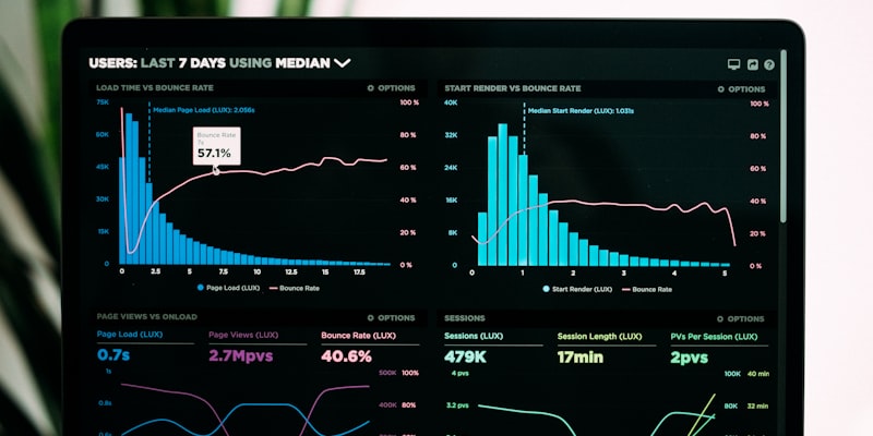
Mobile performance optimization is crucial for user experience and business success. Even a 100ms delay in loading time can reduce conversion rates by 7%, while a one-second delay can increase bounce rates by 32%.
Effective mobile performance optimization involves technical optimizations, smart resource loading strategies, and user experience design that gracefully handles loading states and slow connections.
Performance Optimization Strategies
Critical Resource Prioritization: Load above-the-fold content first using resource hints (preload, prefetch). Defer non-essential JavaScript and use code splitting to load features only when needed.
Image Optimization: Use next-generation formats (WebP, AVIF) with fallbacks. Implement responsive images with proper sizing and lazy loading. Consider using placeholder images or skeleton screens for better perceived performance.
Network Awareness: Implement adaptive loading based on connection speed. Provide low-bandwidth modes for slow connections and progressive enhancement for faster networks.
Caching Strategies: Use service workers for intelligent caching and offline functionality. Implement proper browser caching headers and consider edge caching for static assets.
6. Mobile Content Strategy

Mobile content strategy requires rethinking how information is presented and consumed. Mobile users are typically task-focused, time-constrained, and easily distracted, requiring content that's immediately useful and easy to digest.
Effective mobile content strategy involves content prioritization, progressive disclosure, and formatting that works well on small screens. Every piece of content should serve a clear purpose in the user's journey.
Mobile Content Best Practices
Scannable Formatting: Use short paragraphs, bullet points, and clear headings. Break up text with whitespace and visual elements. Users should be able to quickly scan and find relevant information.
Front-Load Important Information: Put the most important information first in each section. Use the inverted pyramid approach—essential information first, supporting details second, background information last.
Progressive Disclosure: Show essential information immediately and provide clear paths to more detailed content. Use expandable sections, tabbed interfaces, and layered navigation to manage information density.
Touch-Friendly Content: Ensure all interactive content elements are easily tappable. Use clear calls-to-action, avoid ambiguous links, and provide enough spacing between interactive elements.
7. Testing & Validation Methods
Mobile testing goes beyond checking if your site works on different screen sizes. It involves testing performance under various network conditions, validating touch interactions, and ensuring accessibility across diverse mobile contexts.
A comprehensive mobile testing strategy combines automated testing, real device testing, and user validation to ensure your mobile experience works flawlessly for your target audience.
Comprehensive Testing Framework
Device Testing Matrix: Test on representative devices covering different screen sizes, operating systems, and performance levels. Focus on devices your analytics show are commonly used by your audience.
Network Condition Testing: Test your site under various network conditions including 3G, poor WiFi, and offline scenarios. Use Chrome DevTools network throttling and real-world testing in different locations.
Usability Testing: Conduct mobile-specific usability testing focusing on touch interactions, one-handed usage, and task completion. Test in realistic contexts—while walking, in bright sunlight, with gloves.
Accessibility Validation: Test with screen readers (TalkBack, VoiceOver), high contrast modes, and large text settings. Ensure your mobile experience works for users with different abilities and assistive technologies.
Common Mobile Design Pitfalls to Avoid

Critical Mistakes That Kill Mobile UX
Tiny Touch Targets: Buttons smaller than 44px are difficult to tap accurately, leading to user frustration and task abandonment. Always test touch targets with actual fingers, not mouse cursors.
Overwhelming Content: Cramming desktop content onto mobile screens creates cognitive overload. Prioritize essential content and use progressive disclosure for additional information.
Slow Loading Performance: Mobile users are particularly sensitive to slow loading times. Optimize images, minimize HTTP requests, and prioritize above-the-fold content loading.
Ignoring Context: Mobile users often have different goals and contexts than desktop users. Design for mobile-specific use cases like location-based services, quick tasks, and on-the-go access.
Poor Form Design: Complex forms with small input fields and poor keyboard handling create significant friction. Simplify forms, use appropriate input types, and provide clear validation feedback.
Mobile Design Tools and Resources
The right tools can significantly streamline your mobile design process and help you create better experiences more efficiently.
• Sketch for Mac-based workflows
• Adobe XD for prototyping
• Google PageSpeed Insights
• Lighthouse for performance
• Responsive design mode
• Network throttling tools
The Mobile-First Future
Mobile-first design has become the foundation of modern digital experiences. By prioritizing mobile users and progressively enhancing for larger screens, we create more focused, performant, and accessible interfaces that serve users better across all contexts.
The most successful mobile experiences in 2025 will be those that understand mobile isn't just a smaller desktop—it's a fundamentally different way people interact with digital content. These experiences will be fast, intuitive, and perfectly adapted to how people actually use their mobile devices.
As mobile technology continues to evolve with 5G networks, advanced processors, and new interaction methods, the core principles of mobile-first design—simplicity, performance, and user focus—will remain the foundation of exceptional digital experiences.
Start implementing these mobile-first UI/UX design principles today. Your users will experience seamless interactions across all devices, and your conversion rates